
J+R GROUP Brand Identity & Digital
J+R Group cultivates commercial and residential properties across the Pacific Northwest and Southern California, offering sustainable and open design that helps shape their tenants' vision. We designed their brand to be bold, energetic, professional and polished like their philosophy. The geometric J+R letterforms create a mark that's always moving forward and reflects their contemporary architecture style.


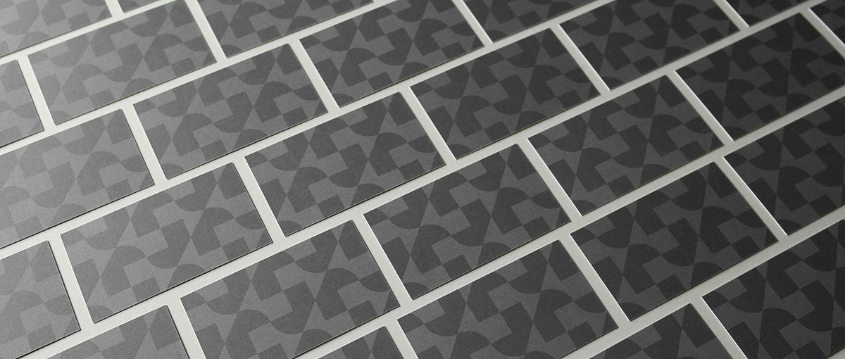
Corporate stationery was printed on antique gray paper using PMS 426 U and Cool Gray 2 U inks. A tone-on-tone repeating pattern on the cards creates a striking first impression.


A Brand Styleguide outlines rules for the identity system including logo lock-ups, color formulas, typography, photography and graphic motifs. The guide is an important tool in creating brand cohesion.


A dynamic, responsive website tells the story of each property through photography, renderings, design details and data graphs. We partnered with Eat. Sleep. Work. for development.


